Marion Meyers

Come out for my solo show of encaustic paintings!

My Perspective on Windows and Doors. A Solo Exhibition of Paintings by Marion Meyers

Colborne Art Gallery, Ontario

June 9, 2018 through July 22, 2018

Opening Reception: Saturday June 9, 2018, 2 to 4 pm

Bodega Kitchen encaustic on birch panel 12″ x 36″
Musee d’Orsay Window on the Seine encaustic on birch panel 12” x 36”

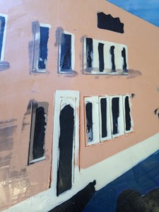
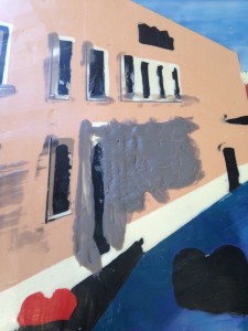
Windows and doors: they seem to tell me, “You’re welcome here.”, or “No one cares.” Would I like to open that door? Bang on that knocker? Reflect on what goes on behind that window? I imagine being on the other side, looking out that window or just admiring how the light streams in. I find odd angles intriguing and often work the architectural patterns of windows and doors into abstract work.

For years I had a recurring dream of a giant old warehouse building filled inside with what appeared to be a giant “Mousetrap” game. And I rode around in a small cart, like I was on a single-person roller coaster, going in and out of doors in walls and windows in the frame of the warehouse, bumping into things and setting off chain reactions of cogs and wheels turning. It was a gritty, grimy place of clanging metal and old wood. Years later we played a video game called Riven, where finding the right door or knob to turn would open a passageway, leading you to the next window or hole in the wall to climb through. It was dark inside with light streaming in where you might find a way out or back into the game again. Just like in my dream.

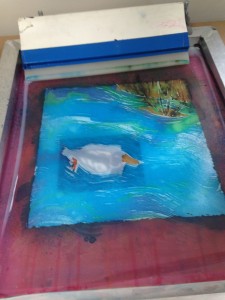
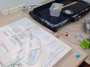
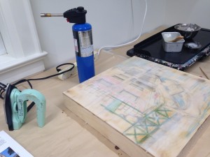
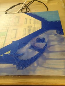
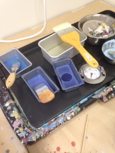
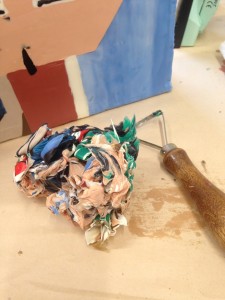
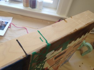
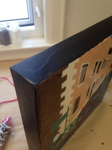
There are always strong lines in images of windows and doors and often repeating patterns, gorgeous colours and texture. These images come out in the texture and piecing of quilted wall hangings. The images swirling in my head, either from photos I’ve taken or abstract impressions of places, are ideas I bring out in my encaustic paintings. Encaustic medium is an ancient process of melting beeswax and damar resin together with pigment to paint, hot and fluid, on birch panels. It dries immediately and each layer of encaustic paint must be fused with a blow torch, heat gun or hot iron to the layer beneath. Encaustic paint is a wonderful medium for scraping away, layering colour, adding texture and making glossy surfaces, all key elements of My Perspective on Windows and Doors.

The Colborne Art Gallery

51 King Street East, Colborne, Ontario

905-355-1798

Gallery Hours During Shows: Thursday to Sunday 12 to 4 pm

Making a block print for Monoprints

I love working in the soft linoblock to find my duck.

A block is a piece of wood, linoleum or styrofoam used as a matrix for a print. Ink, a mixture of pigment suspended in a water-soluable base with gum arabic, is used for block and Collagraph printing. 

Inking a lino cut
Inking a lino cut


The ink is applied to the block with a brayer, the block is flipped and positioned on the paper and then a baren or spoon or even just your thumb is used to press the paper into the block to transfer the ink.

Linocut of duck and test print

The number of images printed from the block is called an edition. These identical images are pulled by the artist (in my case) and then numbered in pencil directly on the print (for example, 1/10 through 10/10)

I've got a dry print of my duck, centered it and taped it under the screen.
I’ve got a dry print of my duck, centered it and taped it under the screen.


In many of my prints I make a block print (take a look at my duck) and then a monoprint over it. By adding the monoprint over the block print I’ve make each one unique. These are numbered with “V.E.”, meaning various editions.

I learned this technique in a program with Linda Kirstin Blix. You can find her at her website.

Sign Up Now for News

You can see that I didn't paint my screen where the duck would be, and I did this loosely because I like the effect of not having a tight image. The areas left unpainted on the screen will be the white of the paper on the finished print. Those clear areas also allow the black ink of the underlay print to remain crisp.
You can see that I didn’t paint my screen where the duck would be, and I did this loosely because I like the effect of not having a tight image. The areas left unpainted on the screen will be the white of the paper on the finished print. Those clear areas also allow the black ink of the underlay print to remain crisp.
I've pulled the monoprint, in this case fabric dye painted on the silk screen, over a print I did in ink of my duck linocut. You can see that I masked off the shape of the duck before pulling the print.
I’ve pulled the monoprint, in this case fabric dye painted on the silk screen, over a print I did in ink of my duck linocut. You can see that I masked off the shape of the duck before pulling the print.

So What is a Monoprint?


Using a photo of poppies from my garden as a reference I paint the dye on the screen is a loose painterly way. The screen is raised from the table on shims so that the tabletop doesn't interfere with my painting.
Using a photo of poppies from my garden as a reference I paint the dye on the screen is a loose painterly way. The screen is raised from the table on shims so that the tabletop doesn’t interfere with my painting.

Monoprints and Monotype are the most painterly among printmaking techniques. They are essentially printed paintings; one-of-a-kind prints conceived by the artist and printed by the artist. No two prints are alike: although some images can be similar. The appeal of the monoprint/monotype lies in the unique translucency that creates a quality of light very different from a painting on paper or a print. This combination of painting, printmaking and drawing mediums is spontaneous.

Monoprinting is a unique process using a combination of painting and traditional printmaking processes. I used a Silk Screen frame with a stretched mesh fabric (historically silk) and paint with a brush, sprayer or wooden sticks on the screen with Procion “H” fabric dye solutions.

The liquid fabric dye solutions are in a pot pallet but you can't see the colours easily so I've done a colour chart beside my pallet. I use other cups to mix colours. Or I layer colours on the screen as I paint.
The liquid fabric dye solutions are in a pot pallet but you can’t see the colours easily so I’ve done a colour chart beside my pallet. I use other cups to mix colours. Or I layer colours on the screen as I paint.

These dyes are responsible for the brilliant colours. Once the dye is dry, I use a traditional print making technique. A single sheet of Acid-free paper is placed under the screen and taped down. The screen is held up, and using a squeegee I flood the screen with wallpaper paste. In a monoprint, it is the flood stroke that allows the dye to soften. The wallpaper paste, Dynamic 212 premixed, is tested for lightfastness. I then lower the screen onto the paper and pull the print, using the squeegee again with firm pressure to push the dye and paste through the screen onto the paper. You now have an original fine art print. It will be numbered 1/1, named and signed in pencil.

I've finished my painting of the fabric dyes on my screen. As the dyes dry they get much lighter than the finished print will be.
I’ve finished my painting of the fabric dyes on my screen. As the dyes dry they get much lighter than the finished print will be.

I learned these techniques in a program at the Haliburton School of the Arts with the fabulous instructor, Linda Kristin Blix. You can find Linda’s work on her website.

Creating a Collagraph

I spent a week with Linda Kristin Blix at the Haliburton School of the Arts in the summer of 2015 and joined her course at Arts at the Albion in Gravenhurst that fall. Linda is a fabulous teacher. One of the processes we studied was making a Collagraph. A Collagraph is a print made from a specially constructed plate that has been produced in a collage manner, resulting in high and low surfaces which hold the ink differently during printing. Here are a few photos of this process. You can find Linda, her work and her classes on her website.

I cut out thin sheets of foam and glued them in layers to create a printing plate in foam.
After finishing my foam plate, I inked it in a few colours, layered it with black paper and rubbed like crazy with a wooden spoon to transfer the ink.
A relaxed image of a poppy garden. Ink on paper. There's only one - so it's a monoprint!
A relaxed image of a poppy garden.  Collagraph. There’s only one – so it’s a monoprint!


How I Create Urban Landscapes in Encaustic

Canali di Venezia, encasutic on birch panel, 16" x 16", Marion Meyers, 2016
Canali di Venezia, encaustic on birch panel, 16″ x 16″, Marion Meyers, 2016 –

I’ve always loved to paint urban and rural landscapes and in oil painting landscapes are a common subject. However, when I started to paint in encaustic medium I discovered that it’s hard to get those clean edges that you need for the lines, perspectives and boundaries between colours when painting buildings. So I had to create a way to do this with the techniques I’d learned.


Venice: pencil perspective
I was working from a photograph in a 2:3 size ratio and my substrate of a birch panel was square (16″ by 16″) I couldn’t just chop off a bit of the image on each side; I’d lose my gondola guy on the left and the other side of the canal on the right, so I played around and changed the perspective. I do my drawing in pencil onto the birch panel.


Venice: filling in the drawing
I use a ruler and mark my horizon line. Then I add in the detail I think I’ll need for the blocking off of various areas of the painting.


Venice: adding pencil crayon colour
I used coloured pencils in some areas just to help my eyes sort out the image areas because they’d get a but fuzzy as I layered on the base of encaustic medium.
Venice; first layer of wax
I melt the encaustic medium on my griddle. Then I heat up the wood with my heat gun to make it more receptive to the first layers of medium. The medium goes on fluid and hot with a soft, fine large brush. After each layer goes on, I fuse it. For this stage I like using the blow torch to fuse.


Venice: layers of medium
For this base of medium, I give the board a quarter turn with each layer, fusing as I go. When I get to the very last layer of medium I also use my encaustic iron to smooth it all out. You can still see my drawing through these four layers of medium. This is one of my favourite parts of the process. The painting must be set aside for the day at this point to harden well.


Venice: masking off background
The next day I use painters tape to create an edge for the area of the painting that I want to paint first. Here I’ve taped the edge of the buildings and the gondola next to the sky in the background and the water of the canal in the foreground.


Venice: the first layers of colour
So here’s one layer of colour for the sky and one for the water. I’ll fuse between each layer, building up wax for about 6 or 8 layers of colour. I need this many, as I will be scraping some away and carving into some parts.
Venice: mixing paint
I’ve got some paint melting on my griddle. I’ll explain how I mix the colours some other time! I’m going for various shades of blue for the sky and water. These first colour layers are fairly solid in colour as I can add colour farther along in the process.


Venice: fusing with a heat gun
I fuse using the heat gun as I find this is the easiest tool for controlling the heat in very small areas.


Venice: multiple layers
And here it is built up with many layers and various hues.
Venice: peeling the mask off
Now I’ll peel away the tape, pulling away at the sharp angle to keep the edge clean. The wax needs to be a bit soft to do this, so you can’t build up areas of wax and walk away for an hour and expect to be able to come back and peel it up. It will be very hard.


Venice: keeping it organized - Using my print out of the photo, I work out a plan for what order to work. I need each area to harder for a day before adding a colour right next to it. This helps to prevent colours from bleeding into each other.
Using my print out of the photo, I work out a plan for what order to work. I need each area to harden for a day before adding a colour right next to it. This helps to prevent colours from bleeding into each other.
Venice: working the plan - So following the plan of what to do next, I'll mix more colour and medium and mask off areas that are next to where I am filling in the painting. Because I have to fuse each of the six or eight layers, I need to protect what's already there and keep paint away from where another colour is going.
So following the plan of what to do next, I’ll mix more colour and medium and mask off areas that are next to where I am filling in the painting. Because I have to fuse each of the six or eight layers, I need to protect what’s already there and keep paint away from where another colour is going.
Venice: building up the smaller background areas may be a good idea at this stage so I've done the window frames and fence = very fussy! For those little wee fence strips I use an razor blade to cut strips in my tape, and I use a couple of layers of tape to make it stronger. I'll do all the verticals first, then horizontals and then the ones on the diagonal - yikes - it helps for when you peel it all up.
Building up the smaller background areas may be a good idea at this stage so I’ve done the window frames and fence = very fussy! For those little wee fence strips I use an razor blade to cut strips in my tape, and I use a couple of layers of tape to make it stronger. I’ll do all the verticals first, then horizontals and then the ones on the diagonal – yikes – it helps for when you peel it all up.
Venice: masking off is tricky work - you can see that you need to be precise and why I did the drawing underneath it all.
Masking off is tricky work – you can see that you need to be precise and why I did the drawing underneath it all.
Venice: 8 layers of wax with colour - you can see that I've done doors, windows, the side wall, the building in the distance and part of the dock, leaving that middle ground for the end.
8 layers of wax with colour – you can see that I’ve done doors, windows, the side wall, the building in the distance and part of the dock, leaving that middle ground for the end.


Venice: warming the base
When I start painting in an new area, it needs a bit of warming up with the heat gun.
Venice: filling large areas - I often fill in window areas first and then fill in around them another day. These windows and doors were masked off first and then I start to paint in the stone facade.
I often fill in window areas first and then fill in around them another day. These windows and doors were masked off first and then I start to paint in the stone facade.


Venice: the colour blocks are done and you can see that the surface looks bumpy with some edges higher than others.
The colour blocks are done and you can see that the surface looks bumpy with some edges higher than others.
Venice: I heat up areas of the painting of about 4" by 4" and very carefully scrape up those bumps and rough edges, revealing the sharp clean lines of the original image.
I heat up areas of the painting of about 4″ by 4″ and very carefully scrape up those bumps and rough edges, revealing the sharp clean lines of the original image.
Venice: after scraping the surface level away I'm left with a fairly flat and even surface. This is physically hard to do and I must be careful not to gouge any holes. It takes a long time to get the whole surface done. The painting isn't attractive at this stage and it's hard to keep motivated.
After scraping the surface level away I’m left with a fairly flat and even surface. This is physically hard to do and I must be careful not to gouge any holes. It takes a long time to get the whole surface done. The painting isn’t attractive at this stage and it’s hard to keep motivated.
Venice: cleaning up the sides - this is the best time to scrap away drips on the sides and use a hot iron to melt away wee bits.
This is the best time to scrap away drips on the sides and use a hot iron to melt away wee bits.


Venice: These lovely panels have deep sides and I could leave them blank so you see the natural birch. I choose to paint these black as I think it gives nice profile to the painting. These panels aren't meant to be framed. I build up the wax on the sides using an ugly mix of all those scraped up bits and do the final couple of areas in pure black.
These lovely panels have deep sides and I could leave them blank so you see the natural birch. I choose to paint these black as I think it gives nice profile to the painting. These panels aren’t meant to be framed. I build up the wax on the sides using an ugly mix of all those scraped up bits and do the final couple of areas in pure black.
Venice: Now I can add some detail. I use metal dental and pottery tools to carve out fine lines for window sills, water pipes, shadows, mortar lines and so on.
Now I can add some detail. I use metal dental and pottery tools to carve out fine lines for window sills, water pipes, shadows, mortar lines and so on.
Venice: The next step is filling the carved bits, pocking the wax into those gouged out lines.
The next step is filling the carved bits, pocking the wax into those gouged out lines.


Venice: Now I'm carefully scraping away the paint on top to reveal those fine lines before fusing.
Now I’m carefully scraping away the paint on top to reveal those fine lines before fusing.
Venice: Now I add fine detail with brass tools. I can attach a variety of nibs onto this heat tool. This one acts like a pen, wicking up paint from solid bars of paint. I can draw on those shadows, window grills, balconies, fence posts, waves in the water. This tool fuses the paint on so that I don't have to fuse - but I can if I want! I also have little brass "paint brush" and it's good for those larger shaded areas or individual brinks.
I add fine detail with brass tools. I can attach a variety of nibs onto this heat tool. This one acts like a pen, wicking up paint from solid bars of paint. I can draw on those shadows, window grills, balconies, fence posts, waves in the water. This tool fuses the paint on so that I don’t have to fuse – but I can if I want! I also have little brass “paint brush” and it’s good for those larger shaded areas or individual brinks.
Venice: almost finished - I use the tips of brushes to paint on waves and other bits. I also use paint sticks to add texture, shadow and colour to various areas. I'll have to write more about that another time!
Almost finished – I use the tips of brushes to paint on waves and other bits. I also use paint sticks to add texture, shadow and colour to various areas. I’ll have to write more about that another time!


Lake Scugog Studio Tour, Site #2

I’ve been busy painting and quilting this winter in preparation for the Lake Scugog Studio Tour. I’ve done more paintings in my series of urban landscapes of St. John’s and have started to work on a series from photos I took in Sweden. I’ve also done more of the In The Birches series. My quilting is all over the place, from modern to abstract art to traditional. I hope to see you on the tour. You can start at my studio, 34 Woodbridge Circle, Port Perry, Ontario, and I’ll give you a map to take you to 12 other studios with a total of 32 artists. When you Google or set your GPS use the town name “Scugog” to find me easily.

Beach Glass Lap Quilt 100% cotton with wool batting Designed by Weeks Ringle and Bill Kerr Pieced and Quilted by Marion Meyers 2014 $500
Beach Glass
Lap Quilt
100% cotton with wool batting
Designed by Weeks Ringle and Bill Kerr
Pieced and Quilted by Marion Meyers
2014
$500 SOLD
An Early Snow in St. John's #3 Encaustic on birch panel 12" by 12" Marion Meyers 2014 $385
An Early Snow in St. John’s #3
Encaustic on birch panel
12″ by 12″
Marion Meyers
2014
$385
The Understory Encaustic, birch bark, leaves on birch panel 11" by 14" Marion Meyers 214 $265
The Understory
Encaustic, birch bark, leaves on birch panel
11″ by 14″
Marion Meyers
214
$265

Juried into two National Juried Shows – Paducah, Kentucky and Canada

There’s one really big quilt show in Canada put on by the Canadian Quilt Association and called “Quilt Canada”. This is a juried show of about 85 or so quilts. This year the show is in St. Catharines, Ontario in June 2014. I had my quilt Floating in this show 2 years ago. This year I entered two quilts, Friends and Retired Not Retiring. Friends is a large wallhanging designed by Michele Hill of Australia. It is raw-edge machine applique (if anyone knows how to get WordPress to add an accent, please send me directions!) The other quilt, Retired Not Retiring, I designed for my brother and sister-in-law to give as a gift in honour of their retirements and a big move to a custom-designed modern home in Goderich, Ontario. I’m SOOO excited! And to top it all off, they both got into the juried show called “Quilt Week” that takes place in Paducah, Kentucky. Richard and I went to this show last year and they had about 400 quilts in the show. I’ll be travelling to both shows this spring – who can resist seeing your quilt hanging at such wonderful shows!

I designed this quilt for my brother John and his wife Barb, when they announced their retirements and the big move from Toronto to Goderich. It's made of hand-dyed fabric and is my original design. It's a bed quilt and is perfectly square - but it's hard to get it to hang straight on a skinny metal pole! Click through to see more detail photos. Or check my Blog as I may post more photos there.
I designed this quilt for my brother John and his wife Barb, when they announced their retirements and the big move from Toronto to Goderich. It’s made of hand-dyed fabric and is my original design. It’s a bed quilt and is perfectly square – but it’s hard to get it to hang straight on a skinny metal pole! Click through to see more detail photos. Or check my Blog as I may post more photos there.
This William Morris inspired quilt was designed by Michele Hill. It is raw edge applique finished with a machine blanket stitch. I LOVED making this one. It took two years. People ask me how long it took and I really should track the hours as I make this type of quilt. Next time.

Sharp Lines in Encaustic Paintings

I use quite a few different techniques when I paint in encaustics, and have found a unique way to create urban landscapes. I start with beautifully hand made birch panels. And photographs I’ve taken in my travels are my references for drawings. I draw in pencil directly on the birch panels. With these urban landscapes sharp clean lines and accurate perspectives are important and I would lose them if I didn’t have a drawing down first. I then paint on the beeswax and damar resin mixture in thin layers with no added pigment. Typically it’s 6 or 8 layers. I like to work on three pieces at a time so that I’m not waiting around for layers to solidify, ready for the next layer to be added. I use painter’s tape to mask off areas of my underdrawing and then layer on the colour! Usually 12 layers. The wax needs to be not quite set for me to pull up the painter’s tape to reveal the sharp clean edge. Once this is allowed to harden another colour will go beside it. By laying on many layers I get a thickness that can later be carved away to reveal nice sharp lines.

Up This Way #2 Encaustic on Birch Panel 8" by 8" Marion Meyers 2013 $300
Up This Way #2
Encaustic on Birch Panel
8″ by 8″
Marion Meyers
2013
$300

Mourning Doves for Durham Community Foundation

IMG_0647

Mourning Doves is a quilted chair done in 100% cotton fabric, with appliqué and trapunto techniques. It is on display at the Abilities Centre in Whitby, Ontario

I was asked by Durham Community Foundation to participate in a Chair Affair as part of the Odyssey Ball. Artists were invited to pick up a piece of broken furniture and transform it into a piece of art. They will be part of a live auction at the ball on Feb 2 2012. I went out to Mackie Moving  where they had gathered broken or damaged furniture and invited eleven artists and designers to come pick out something to transform. I picked out a worn out bedroom chair. When I got it home I discovered that it was in terrible shape and required more than the quilted slipcover I had imagined. It needed new springs, foam and padding. I imagined it as an accent piece in a bedroom or foyer. I have many Mourning Doves in my garden and they have such lovely silhouettes. Mine sit in an arbour, but their shape is lovely on a wire. The doves are appliquéd onto the cream fabric and batting is added behind them using a trapunto technique to make them puff out. You may be able to see the trapunto effect on the seat in the turquoise fabric. Then I layered more batting and another layer of fabric and quilted each of the eight pieces. Andrew of Uxbridge Custom Upholstery took my pieces and did a fabulous job of rebuilding it. When it was done and I showed it to my friend Sue Carmichael at Quilters Cupboard in Uxbridge, she said it was calling out for a pillow! What a lovely added touch. I’ll write a post about the new owner after the auction!